The World Like You’ve Never Seen Before
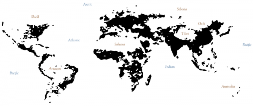
What if one were to propose that the political divisions that exist on the globe cease to be relevant in the internet-centric dynamic that exists today? What barriers really divide the world’s people? A peek into Derek Watkins’ version of William Bunge’s The Continents and Islands of Mankind shows below the areas of the world where the population density is greater than 15 people per square kilometer. Instantly, we see the world break up into these distinct congregations – “hubs”, if you will. These hubs stretch across country and continental borders.

Derek Watkin’s rendition of William Bunge’s The Continents and Islands of Mankind shows areas in the world where there are at least 15 people per square kilometer.
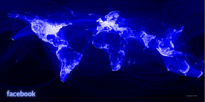
This gives a rudimentary mental picture about how the network of all people are distributed. Paul Butler, a Facebook intern, took this a step further. Facebook data enabled him to map a graph of the world’s largest social network on the map.
His beautiful graphic visualization, very interestingly reveals various distinct white patches, regions of extremely dense intra-hub connectivity. The location of these hubs, barring a few anomalies (read: lack of Facebook usage in China), is extremely concordant to the islands of Derek Watkins. A visualization with a similar concept, by Walter Rafelsberger, shows a graph of conversations on Twitter. While the quantity of his data was far less then Paul Butler’s, his visualization also highlights some inter-connected areas like east and west United States, and Europe – the same “hubs” highlighted by the previous experiments.
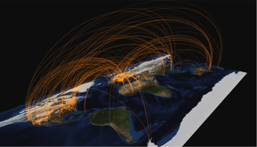
Our last visualization, credited to twitter user @miguelrios, shows a video of the flow of tweets from Japan during the earthquake of March 11, 2011 to other regions of the world, and its subsequent spread across the world. The network looks dense, but if one looks intently enough, instantly the same “hubs” bubble to the surface.
Flow of Tweets from and to Japan during the March 11, 2011 Earthquake
Where am I going with this? I’m suggesting that this sort of analysis of online internet activity over social networks reveals a dynamic amongst mankind that we are completely oblivious of – data that never existed before the turn of the millennium. I’m suggesting that the social activity as suggested by online interactions redefine the boundaries- socially, culturally, and geographically – that define the world we live in.
A look at the findings from the Facebook map graph and the Interactive Islands divide the world into specific countable, highly connected “hubs”. In graph theory, they would be called (although not strictly adhering to the definition) connected components. For example, the thin west coast of the United States, the wider east coast of the United States, Mexico, the Brazilian coast, India and China are a few. We know that, in this age, the world contains, if we strictly abide by the principles of graph theory, a single giant connected component. Suppose we stretched this definition of “connected component” somewhat. Let’s define the “connectedness” of an arbitrary region to be the number of edges inside the region divided by the number of nodes in the region. If we could hypothetically calculate the connectedness of these “hubs”, I anticipate that the “connectedness” of these regions would drastically stand out from the “connectedness” of arbitrary regions stretching through multiple hubs. I further predict that if we draw out all regions on the map where the connectedness is above a certain fairly low margin, the data will reveal for us mathematically the borders of these “hubs”.
The two next visualizations show the spread of information through tweets. We could use the conclusions made my Mark Granovetter in his paper, “The Strength of Weak Ties” in conjunction with the visualization to further assert my assertion of the existence of “hubs”. Mark Granovetter showed how the spread of information through networks occurred through weak ties in between strongly connected components. Eytan Bakshy, a data scientist at Facebook, found similar results. Information transfer happened primarily through weak ties, contrary to what intuition might tell you. Weaker Facebook friends are more likely to share each others information than stronger friends on account of the stronger friends’ common information bank. In the video showing tweet flow during the Japan earthquake, we observe an increased flow of information in between these proposed “hubs” instead of within them. Given Mark Granovetter and Eytan Bakshy’s suggestions that information flow occurred primarily through weak ties we could call these inter-hub edges weak, and the intra-hub edges strong. This conclusion further ascertains the existence of distinct hubs.
Essentially all these visualizations seek to show us the world from a simplistic network-like perspective as seen from online presence. It shows us major components – which cross country and continental barriers – and the major nodes inside those components. With sufficient data we can effectively model the world as a social network based on internet activity. We can model communities and cultural entities like never before. We can completely restructure the map of the world as we see it now and reveal how the world’s people really interact with each other. We can see how certain geographical regions behave like strong social circles, and which people are not as connected. Social networking has done away with the constraints of distance and have brought together people of similar language, culture and society to form entities that the map of the world can’t show us. It’s the world like you’ve never seen before.
-Deedy
Sources:
(1) Watkins, Derek. “Interactive Islands of Mankind” April 16,2012.
(2) Butler, Paul. “Visualizing Friendships” December 13,2010.
(3) Rafelsberger, Walter. “Twitter Conversations Map” July 2, 2008.
(4)@abdur, @miguelrios. “Global Pulse” June 29, 2011.
(5) Granovetter, Mark. “The Strength of Weak Ties” American Journal of Sociology, 1973.
(6) Bakshy, Eytan. “Rethinking Information Diversity in Networks” Jan 17, 2012.


