
Many of us, especially in the early days of this pandemic, were glued to graphical representations and epidemiological curves showing how the SARS-CoV-2 virus was affecting our county, state, and country. Some preferred log scales to linear; some preferred animated graphics that followed locations over time, some just wanted to know if cases (or deaths) were going up or down. Seeing the graphs helps to understand (a bit) the current situation and how we may use it to predict the future.
Shelters have been asking similar questions: What is happening in regards to animal intake, outcome and foster in the ~3500 animal shelters in our country in these strange times? Is it the same for cats as dogs? Is it the same in different parts of the country? What about the differences in COVID-19 impacts on municipal shelters vs non-profits vs rescue organizations?
Luckily, some data is available. The first to publish trends in the time of COVID-19 was 24Pet®, the company behind 24hour PetWatch microchips and the animal management software PetPoint. PetPoint is used in 1191 animal shelters which have data for both 2019 and 2020, and the company has pulled weekly statistics since March 12, 2020 to illustrate trends. Here is the information from a recent week:
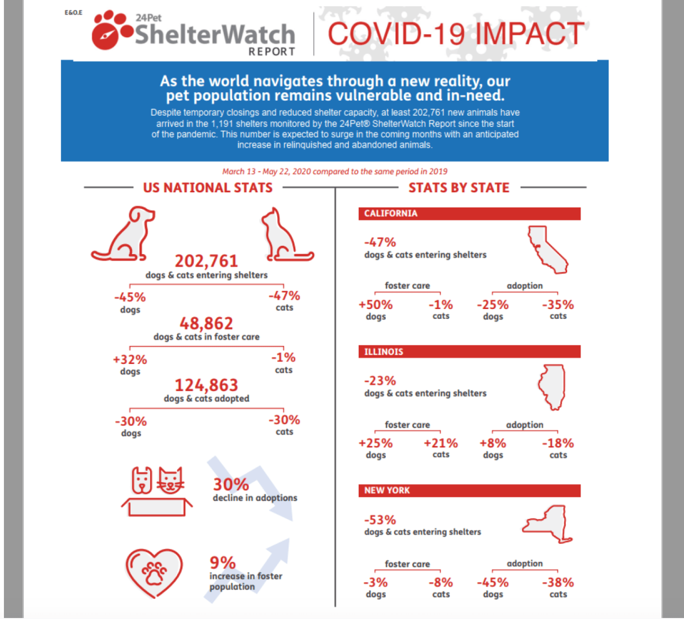
This visualization shows the total shelter intakes (n=202,761) in 1191 US shelters using PetPoint software and how this time compares to the same shelters last year (-45% for dogs, -47% for cats). Foster care and adoptions are reported the same way. In the second column, particularly populous states are highlighted, illustrating some interesting geographical differences.
This report is easy to follow because it is weekly, and covers a range of shelters across the country. It is the only report that looks at foster pets, which is a significant and interesting phenomenon in our industry’s response to the pandemic. New York is being highlighted here, but not everyone gets to see their state’s stats (and it is the same three states every week). What is missing from this visualization is any sense of where we are going as an industry, and what is happening to other outcomes. How are transports going? Are adoptions low because we are just euthanizing everyone? Some of these answers are available in the raw data if you scroll down, but are not in the visualization.
Shelter Animals Count [SAC] is a non-profit organization that solicits basic data from as many US animals shelters as they can, but only on a monthly basis. Monthly charts comparing the 1598 shelters and rescue groups who chose to share their data in 2020 and 2019 have been shared. There is a new data tool, the Covid-19 Impact Dashboard, which is available on the SAC? website. Here’s what that looks like:

This visualization gives you the raw numbers of intakes, and live and “other” outcomes when you mouse over them, and provides a comparison year over year. The line-graph style of monthly intake reporting is extremely helpful, since it shows changes over time and imply a trajectory (though who knows what will happen next month.) And, interestingly, if you look at the national SAC data, it matches the 24Pet® data pretty closely. (The reason for this may be that many of the same shelters using PetPoint also report data to SAC.)
The most powerful part of this dashboard tool is the three little bars in the upper right corner of the screen. On the website, clicking these bars allows a user to select a region, a sub-region, a species, or an organizational type. This allows for comparison of national data (above) to:
just the Northeast just the mid-Atlantic or just mid-Atlantic cats.

It also provides answer to some of those burning questions: for example, are the animals who are not coming into animal shelters right now just being taken into rescues instead?
Rescue shelters only

Although this data set only includes a tiny number of rescue organizations who choose to report to SAC (n=649), it looks like the answer is probably no. It also seems that these rescue groups have not really changed their intake practices at all during this pandemic.
This data illustrates the limit of this information and its visualization: what these beautiful graphics do not show us is why. However, understanding national and regional trends alongside our own local experiences enables us to make more informed decisions and predictions.
