How Y’all, Youse and You Guys Talk
https://www.nytimes.com/interactive/2014/upshot/dialect-quiz-map.html
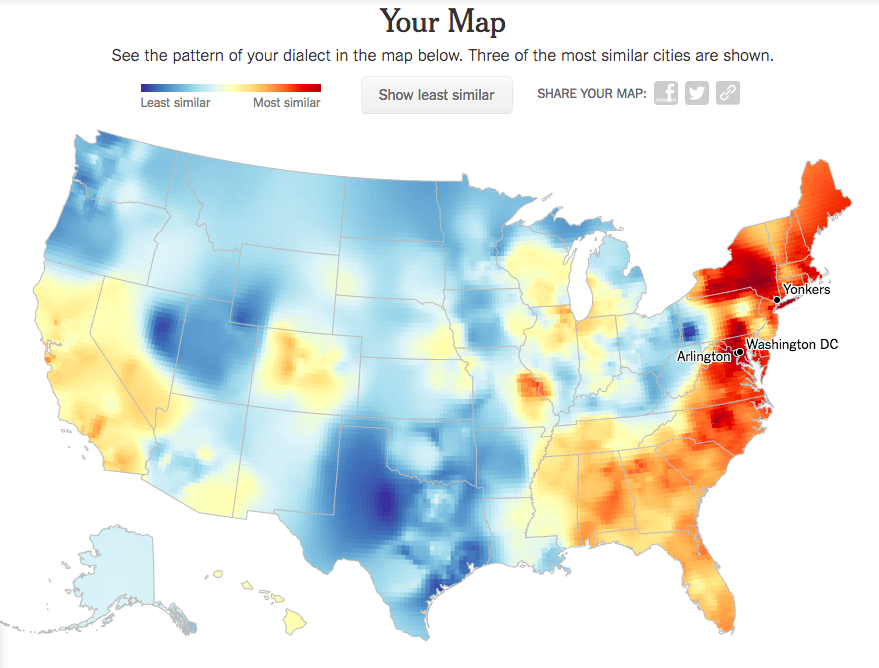
This link brings us to a quiz developed by New York Times graphics editor Josh Katz. The data for the quiz and its results come from more than 350,000 survey responses collected between August and October, 2013. The results of this quiz are shown in heat maps that give us a visualization of American regional dialects. The questions asked in this quiz are based off the Harvard Dialect Survey, a linguistics project begun in 2002 by Bert Vaux and Scott Golder. The colors on the large heat map correspond to the probability that a randomly selected person in that location would respond to a randomly selected survey question the same way that you did. The three smaller maps show which answer most contributed to those cities chosen to be the most similar to you. As an example, I took the quiz and posted my results below.

After answering each of the 25 questions, a similar heat map is shown depicting which regions answered the most and least like you had.

Using Bayes’ Theorem: P(from X region|answer) = [P(answer|from X region)*P(from X region)] / P(answer), Josh Katz was able to calculate where you (the one taking the quiz) are most likely from. And the results are pretty accurate! I am from Scarsdale, NY – just a 10 min drive to Yonkers, the city that the quiz predicted.
In addition to the relevance this quiz has to what we’ve learned in Networks, we can see some evidence of network effects and information cascades (specifically the aspect of copying others, especially those we align with). Below is a map of the 2012 presidential election results. I chose to look at this year since the data that the quiz is based off is from 2013. We can observe some similarities between my regional dialect heat map and the presidential election map. I am not very political, but I would identify myself to be closer on the liberal and democratic end of the spectrum. The areas on my heat map that are red (or of the warmer colors) match similarly to the blue states shown from the election. From this, I infer that those who have similar political views tend to have positive relationships and therefore have more overall interaction (not just politically). Therefore, it would make sense that people would subconsciously speak more alike those they surround themselves with – a form of copying in information cascades. Personally, most of the significant people in my life, friends and family, live in the NY or CA area and share similar political views – thus it makes sense from my experience that we do also tend to speak the same.
