New Resource: NYS Daily COVID-19 Tracker
28 September 2020
The Cornell University ILR School Buffalo Co-Lab, through its Good DEEDS and High Road Policy initiatives, is pleased to announce a new open data tool: our Daily COVID-19 Tracker for New York State (NYS). The NYS Daily COVID-19 Tracker is a real-time resource for monitoring trends in new COVID cases throughout New York State. At bottom, it is a stripped down version of the New York State Department of Health’s COVID dashboard that allows users to quickly visualize and monitor trends for a single county, multiple county areas, or the entire State. It offers a simple, interactive interface for filtering the State’s COVID cases by custom date ranges. Once a user specifies the county or counties in which they are interested and sets the slider to a desired date range, the Tracker displays the trend in cases for those custom settings. Below we walk through an example of how to use the tool to get a handle on daily cases in the Buffalo-Niagara metropolitan area since the start of August. Static screenshots are included where appropriate.
Example/Tutorial: Identifying Recent Trends in Buffalo-Niagara
To facilitate this example, note that the Buffal0-Niagara metropolitan region is made up of two counties: Erie and Niagara. As of this writing, daily COVID-19 case data are available through 26 September 2020.
Step 1: Navigate Web Browser to the NYS Daily COVID-19 Tracker
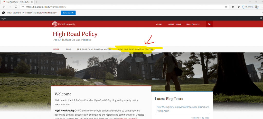
Users can access the Tracker by visiting http://highroadpolicy.org and clicking the “NYS Daily COVID-19 Tracker” button on the main menu:
Clicking on the button highlighted above navigates the web browser to the default Tracker interface, which shows the cumulative number of cases for all of NYS between 1 March 2020 and the most recent date represented in the NYS Department of Health’s source data:
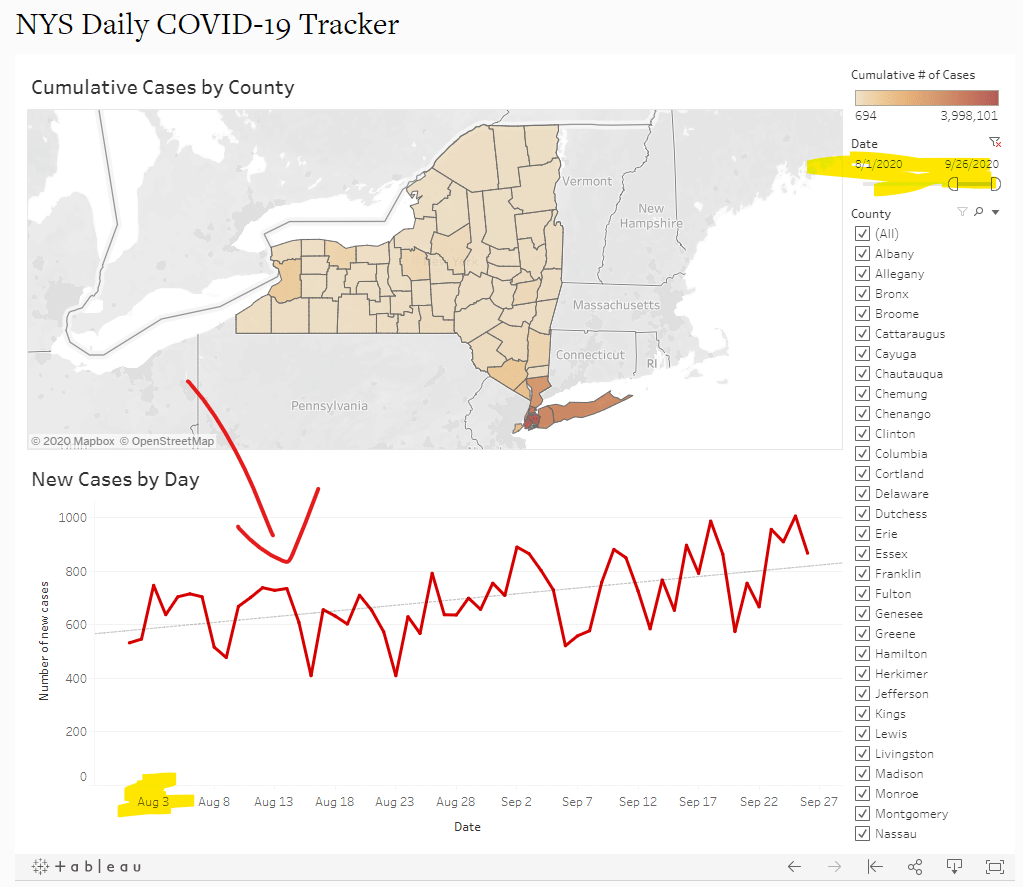
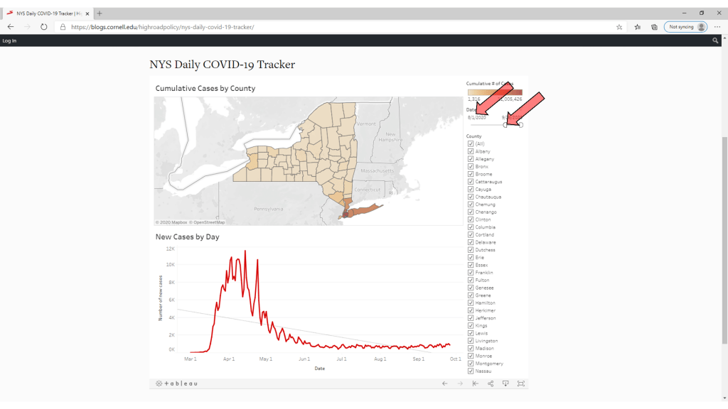
As illustrated above, the default interface is relatively straightforward. The top panel visualizes the cumulative number of cases by county. The bottom panel charts new cases, by day, since the start of the pandemic as a red time series function. The dashed, light grey line running from left to right across the graph is a basic linear trend function. The right panel includes two interactive controls: (1) a date slider, and (2) a county selector.
Step 2: Select a Study Period
Strictly speaking, it does not matter whether users first set the date range or the county (or counties) in which they are interested. However, since the date selector appears above the county selector on the interface, Step 2 begins with the former. That being said, under the heading “Date” in the top-right of the interface, use the start and end point icons to set a date range. Specifically, hover the mouse cursor over the leftmost start point graphic on the slider, click, and drag the icon to the desired start date. For this example, we are interested in the trend in Buffalo-Niagara since the start of August. Thus, we can drag the start point icon until the start date reads “8/1/2020”:
 After arriving at the desired start date, release the mouse click. Doing so changes the starting point for the Tracker, which results in an on-the-fly update to the time series line graph in the bottom panel of the Tracker:
Note that for users who wish to study a time horizon that does not end on the most recent day for which data are available, the end point icon on the right of the time slider can be moved to the left in much the same way we dragged the start point icon to the right. That step is not illustrated here.
Step 3: Select a Study Area
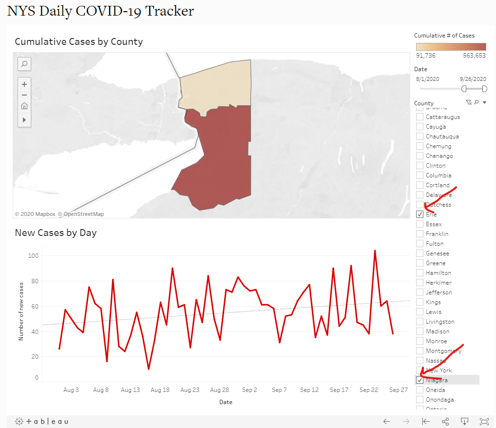
Next, use the check boxes under the heading “County” in the right panel of the Tracker to select the county or counties for trend analysis. To begin, checking the “(All)” box at the top of the list from the default interface will temporarily remove all of the data from the map and time series graph. From there, single-click in the boxes next to the county names to be included in the Tracker. For this example, we check the boxes for “Erie” and “Niagara”. Taking this step automatically (1) zooms the map in the top panel to the selected counties, and (2) updates the time series graph to include only data from the selected counties. In this case, we can see that cases in Buffalo-Niagara trended up between 1 August 2020 and 26 September 2020:
Step 4: Clear Filters and Repeat
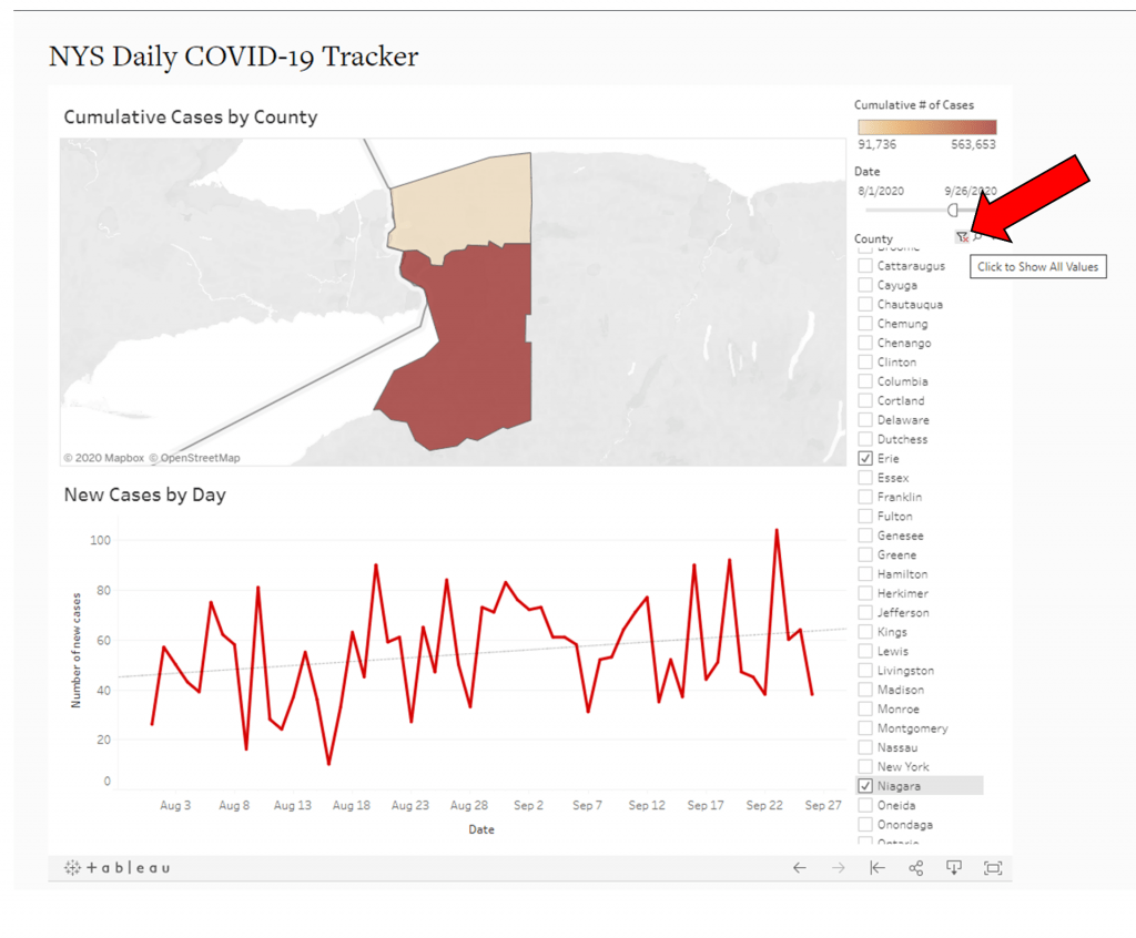
Finally, at any time, to clear the study area or date specifications, users can click the “clear” icon in the respective filter menu. The icon will something like a funnel with a red “x” on it:
Contact: rcweaver@cornell.edu

