 Designing instruction and being a learner in an audience or class, working to learn new things, are flip sides of the same coin. Learning is the intended outcome – but achieving that goal can be tricky.
Were you ever a student or a participant in a class or a training (online or otherwise) that left you feeling too “full”, or confused? Or perhaps it left you reviewing the lesson 2, 3 or 4 times so that you could better understand what was presented? That feeling, referred to as cognitive overload, is real – your brain just can’t handle that much information.
Our job as educators in Extension is often to take complex ideas or research and translate it into information that anyone can understand…yet it is easy to get caught up in academic jargon or the details, leaving our learners frustrated or the learning outcome unmet.

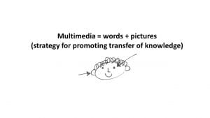
Research indicates that using words and pictures together is an important strategy for providing instruction that promotes deep learning and a transfer of knowledge. Drs. Ruth Clark and Richard Mayer, in their book e-Learning and the science of instruction, describe e-learning multimedia as a combination of text and audio as well as still and motion visuals to communicate content.
These ideas, which may seem like just good common sense, are also grounded in science and research. They go on to describe a list of multimedia principles that are intended to help avoid cognitive overload and help learners more easily grasp complex issues. I’m going to be writing about those principles on our ESP blog and will feature the segmenting principle in this post.
The segmenting principle suggests that breaking a complex lesson down from one large lesson into smaller, more manageable segments can help a learner to more easily understand a lesson. Breaking a big idea down into smaller buckets of content is much like what we would do if we were preparing a course, module or presentation outline.
Clark and Mayer also suggest presenting the ideas one at a time, with a mental break in between to allow for the learner to digest the concept. More time with one concept equates to time for pushing ideas around in your working memory, giving you a chance to relate the concept to prior knowledge.
Can you think of a time when you have participated in an training or lesson set up this way?
More for those of us developing online learning experiences:
- Learner-controlled start and stop: In a study by Schar and Zimmermann (2007) two groups were compared: one watching a continuous animation and another watching an animation which included controls to pause the screen. Both experimental groups proved to have no difference in learning. However, the researcher team suggested that when the animation didn’t have pre-chosen points to stop, the learner didn’t know to make the decision to stop. To be more successful, the lesson designer might be more intentional, inserting auto-pauses at points that make logical sense.
- Learner-controlled learning: In another study, Mayer, Mathias, and Wetzell (2002) presented some learners with a labeled diagram while others were presented with an interactive diagram where if click on the different part, a short summary was read. The students who used the narrated segmented training did better on their performance tests than those who did not.
Worth the effort? Why invest the time to carry out the segmenting principle? Poorly designed instruction wastes time and money. We want to help participants understand what they are being taught, learn new skills and grow in confidence. Research shows that the segmenting principle is a successful method to design instruction of complex issues.
Reflecting on the segmenting principle: How will you use these ideas to plan your next educational program?


