Responsive Design at CUL
Responsive design is a web design approach that aims to create an optimal viewing experience across a range of devices — from large desktop screens and smaller laptops, to tablets and smartphones. Responsive design uses CSS media queries to craft web pages that will respond to a browser’s size, or viewport. Whereas previous web development strategies focused on creating separate desktop and mobile sites — often with redundant content and separate sets of code — in responsive design, the end product is one website that is device-independent, ensuring the best user experience for all users.
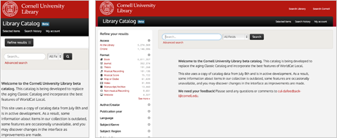
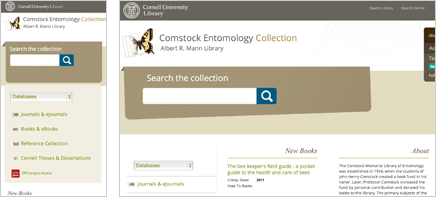
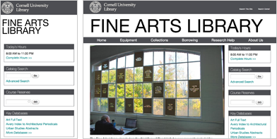
Here at CUL, all new websites are being developed responsively, typically using the Bootstrap framework. Most of our recent redesigns have been responsive as well. Responsive sites that are currently in production at CUL include:
The Library’s new beta catalog
Comstock Entomology Collection
Mnemosyne: Meanderings through Aby Warburg’s Atlas
DCAPS / Digital Consulting and Production Services
In addition, responsive redesigns of the main Library web site, Project Euclid, TEEAL and a number of other Arts & Sciences grants are in progress.
Using a framework like Bootstrap has allowed us to speed up the process for developing responsive sites, although it is worth mentioning that the time it takes to design and develop even a small web site has markedly increased now that we are designing for different devices. Gone are the days where you created one design at a standard screen resolution of 800x600px, tested it in IE and Firefox, and called it a day.
Check out the following websites for more information about responsive design, and to see many examples of responsive websites:
- Responsive Web Design
- Responsive Web Design Guidelines and Tutorials
- Bootstrap
- How to use CSS3 to create a mobile version of your web site
- Media Queries (a showcase of responsive sites)
- Responsive Design Sites: Higher Ed, Libraries, Notables
- Edustyle: sites tagged ‘responsive’


Great work!
From a user perspective (even without knowing much about how the backend works), I can say that these pages are beautiful and a million times easier to navigate than many of our old webpages. Excellent job!