What is Black Farmer Fund?
“Black Farmer Fund (BFF) is an emerging community investment fund that invests in Black food systems entrepreneurs in New York State. As part of our investment process, we emphasize financial education, collective governance and decision-making, and supporting the whole individual and whole community towards community wealth-building and a sustainable future.”
BFF’s Design Challenges
Black Farmer Fund wanted to focus on two components to continue its efforts in raising awareness and growing support for its platform.
- Communication – more concise and clear messaging across the website
- Education – educate others about Black history and BFF’s legacy
Our Team
Our Stakeholders at BFF
Our Process

sessionlab.com
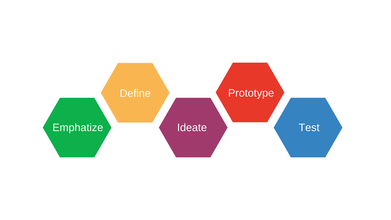
We used the five stages of design thinking to create our deliverables.
[Empathize] Understanding BFF
Before we started discussing deliverables, we made sure to understand BFF’s mission and its history, namely how Black farmers have been historically discriminated against through policies and land theft. The structural racism in the food and agriculture industry has left black farmers marginalized through limited access to land, technical support, and financial access.
To further understand the issue, Melanie proposed the team to research historical Black figures and transformative moments in history that racialized wealth accumulation. We also met with Lex, BFF’s Community Wealth Facilitator, to discuss additional resources we could use for research and to gain a better understanding of the importance of BFF’s mission.
[Define] Deciding the Projects
Working with Melanie, we identified that BFF wanted to convey their narrative of being an investment fund and support system for black farmers and educate others about BFF’s legacy and Black history.
We identified two forms of transmedia knowledge to achieve these goals:
- Redesigning their website to improve content visibility and ease of navigation
- Creating visual media to convey historical Black themes
[Ideate] Outlining the Deliverables
Redesigning the Website
We researched other effective non-profit websites to better understand how to improve BFF’s website. After discussion with Melanie, we prioritized the following changes:
- Call to action – we wanted to include more statements and opportunities on the website that compelled stakeholders to take action.
- Consistent layout – by making the content and layout more visually appealing and consistent, the website would appear more professional and draw investors in.
Infographics
After understanding key Black historical themes and events, we decided on creating a timeline, a comic, and an infographic.
- Timeline – a more structural and formal way to visually represent the extensive history of these events
- Comic – a visual way to showcase BFF’s story
- Infographic – an engaging and artistic way to convey the importance of the events and figures
- We decided on this project last minute and thus, this will be completed after the class ends.
[Prototype] Creating Working Deliverables
Redesigning the Website
We restructured and edited most pages, introducing more call-to-action statements, improving navigation, and creating a more personal and professional visual aesthetic.
Timeline
After Melanie chose a layout for the timeline, we started inputting the color palette, images and text. BFF also had some edits for the infographic as well which we incorporated into the prototype.
Comic
After writing out a script for the comics, we started creating layouts and finding figures on Canvas to incorporate into the comic.
[Test] Our Final Deliverables
Redesigning the Website
After consulting with Melanie and making edits, we finally launched the new website pages.
Timeline
We changed the color scheme of the timeline to better match BFF’s aesthetic.
Comics
With the comics, we changes the layout and the characters to better match BFF’s visuals.
Sharing Our Work
We made a PechaKucha to showcase our work and bring social justice through our storytelling.


