Mapping options – a DSPS Fellowship report
Digital Scholarship and Preservation Services had the good fortune to host Noah Hamm, Public Services Assistant at Mann Library, on a brief DSPS fellowship from from 9/2014-2/2015. One current need that arises as we seek to support of scholars is their need for tools that visualize data as maps. Given Noah’s interest in the visualization of location data, it seemed to be a good fit to leverage his explorations as a way to surface and generally categorize appropriate tools. Below is a general overview of his findings.
DSPS fellowships offer a great opportunity to reach out and develop new skills, explore different aspects of the library system, meet colleagues and get involved in the inner workings of various ongoing library projects. My fellowship involved audio-visual preservation, digital collections usage statistics, and digital humanities topics like concept mapping and text mining. I also had some time to devote to an area of personal interest: online mapping and data visualization platforms. Below is a report on my basic impressions of some of the mapping tools that I explored.
The first impression of a newcomer to the landscape of geospatial mapping and data visualization software, is that it really is an uncharted jungle. There are many different applications for geospatial visualization software – from complex spatial analyses to mapping the family vacation. And, because there seems to be no obvious authoritative or comprehensive accounting of all the different available platforms and their features, it can seem like a real wilderness.
There are some big name companies that have developed geospatial mapping platforms such as Esri’s ArcGIS.com, Microsoft’s Power Map for Excel, and Google’s Fusion Tables. If you want to access existing maps and survey data and customize the appearance of your results, ArcGIS.com is a great choice. If you need to geo-reference your own set of addresses or location data, Google fusion tables is a great choice. And if you want to build a slideshow of your map visualizations and you’re familiar with excel, then Power Map is for you. A savvy user can combine the advantages of these different programs and get great results.
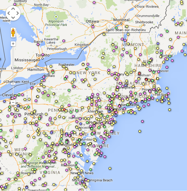
Aircraft accident data mapped with Google Fusion Tables.
There are powerful open-source programs like Quantum-GIS and GRASS for those who want maximal control over the layers of data and imagery going into their projects, greater sets of options for customizing the final appearance and are willing to engage the fairly complicated learning curve associated with the programs interface. These are not recommended for a single-use need but definitely worth the time and effort required to master for a long term project or multiple uses.
For those who have simpler data sets and don’t need or want to download GIS software- Online platforms like CartoDB, and Viewshare offer mapping and data visualization. Mapping US census data is one of the nicest features of SimplyMap and nearly all of the programs I’ve mentioned offer embed code to place the visualization within a specific web environment.
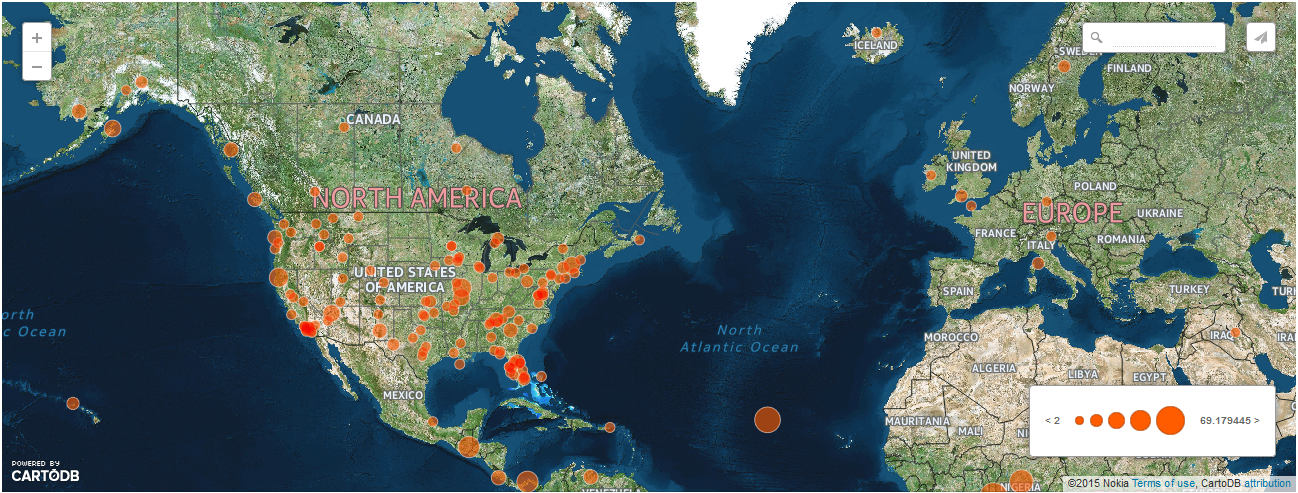
Aircraft accident data mapped with CartoDB
The best fit for a new user will depend largely on the content and complexity of their task and their level of interest in and facility manipulating data sets. My best advice is that they take advantage of the wonderful GIS support and resources in the Library System. There is nothing like a face to face conversation with an expert guide get you pointed in the right direction.
Thanks for the opportunity to see another side of this great Library system!
And thank you, Noah, for sharing your skills and interests with us!