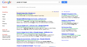
Being near the top really does matter
A topic in class that we have discussed in depth that has been of much interest to me are the concepts of clickthrough rates, revenues per slot for advertisements, and slot placements. Each slot offered by advertisers has a clickthrough rate, or the number of clicks per hour a slot will receive. Buyers also have different values for these various spots, often holding higher values for the slots that have a higher clickthrough rate.
It is no doubt that I click on the first links in a Google search to explore the results of the search. Sometimes I will even ignore the results altogether and look at the Google sponsored advertisements in the yellow box on top because they catch my attention first. In fact, a study found that this is the case for most individuals. In the study “Presentation Bias is Significant in Determining User Preference for Search Results – A User Study,” Judit Bar-Illan and Eti from Bar-Ilan University, and Kevin Keenoy, and Mark Levene from University of London found that regardless of the actual relevance of a search item, people preferred links at the top of their results. The researchers created an algorithm to randomize the search results so that the most relevant result did not appear at the top of the page as it is often configured in Google. The study showed that users were more likely to click the links from the top of the page and go down, rather than actually read through the results to find the most relevant. The study concluded that where the search results were placed was the most important characteristic used by the user to determine the quality of the result. I know I am definitely guilty at looking at the first result first, and weighting more value to the top results as well.
One website that I often frequent is Buzzfeed.com. Buzzfeed is a news and pop culture aggregator that keeps people up to date on what is going on in the world and in the entertainment realm. The majority of the website consists of a series of posts listed on the left side of the website, taking up 2/3 of the page. Similar to the way Google is set up, but with more text and often a picture associated with each story. On the right, taking up 1/3 of the website there is a top ten list of important news stories, with a top ten list of “surging” items underneath the first top ten list. The banner of the website includes specific categories as well a row of smaller pictures that link to other stories not found in the posts below. It is often overwhelming which article to click on and I end up skimming, choosing the post with the most intriguing picture, or most outstanding caption.
I wonder how Buzzfeed.com decides which stories to put where? Is it based on the most current? Or the posts that have already received the most clicks? Buzzfeed.com also has a series of partnerships with a lot of other websites and often provide links to stories on their pages in a post. I wonder if these partnerships play a role in where the stories are placed. Do partnerships pay more based on the posts placement? Do these partners have different values of the placements in the first place? Does Facebook value a top placement more or less than a much smaller website that may not receive any traffic otherwise? These are all ways that page rank theory can be applied to different websites, other than just search engines.
picture of advertisements above and next to search links.
A screenshot of Buzzfeed.com


