Gabriel Halili MRP ’15 talks about designing our new Organization of Cornell Planners (OCP) logo:
“At the OCP Board Retreat we all agreed that the OCP’s three main purposes were to support CRP students in terms of professional development, social events, and external student relations (AAP, faculty, APA, GPSA etc). So I wanted to do something that came in threes. This was the first design I came up with:

I personally did not like this one—It wasn’t enough, it looks like I just messed with the copyright symbol. But I liked the circles, so I tried this:

But this one is too flashy and looks forced and unnatural. So I tried to think of something that was away from the concept of threes and circles. I thought, what symbolizes CRP students the most? How about Sibley itself? Most of our classes are here, and we’re here most of our time anyway. So I sketched Sibley Dome, scanned it and came up with this:
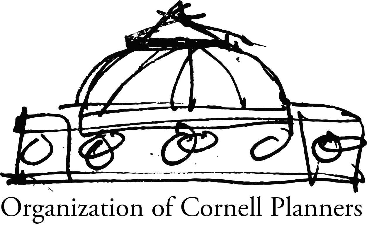
I was planning to make a CAD drawing of the dome, but it was too much work. So I scratched this and tried designing another one, apart from the concept of 3s and circles: