For Stella Betts, of New York’s award-winning firm LEVENBETTS, there are at least 13 ways of approaching a design. When it comes to her architecture, there are 13 ways of looking at a site; 13 ways of scaling a motif; 13 ways of orienting an object; 13 ways of drawing a line; 13 ways of sourcing a material; 13 ways of ascending, of reclining, of passing through. When it comes to interviews, it seems there are also 13 ways of answering a question. Betts and her buildings are never one thing or from one idea, represented in one style, or serving of one purpose. The buildings, most of which are in New York State, often accommodate many programs, serving wide-ranging populations, and integrating themselves into intricate and complicated contexts. With multiple branch libraries under construction and while actively teaching a studio at Cornell AAP on the building type, Betts is fascinated with the generosity and multi-dimensionality of the rare, free, and public space of the library and the amenity it provides both communities and architects as a fruitful design problem.
Fearless in their approach, welcoming of paradox and contradiction with open arms, and always looking beyond the discipline, LEVENBETTS believes in art, architecture, and the library as tools for social change and even revolution. While they have at least 13 reasons why and maybe even the next 13 lined up, it is clear that their studio will never have designed enough buildings or written enough books. Thirteen Ways of Looking at a House, their next book, will be available in print this Fall, featuring 13 houses and 13 topic texts on the elements of domestic space.
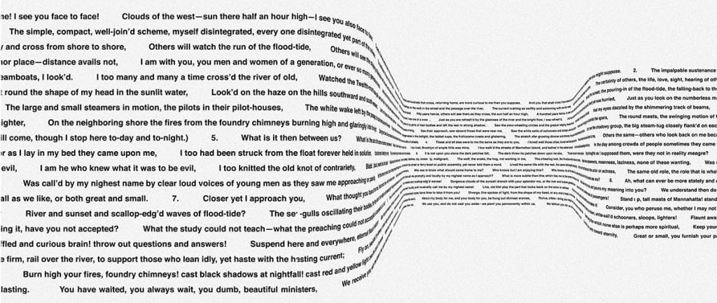
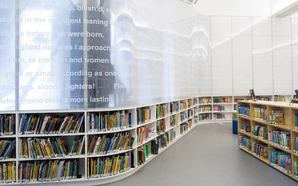 Brooklyn Heights Interim Library detail of the “book worm” wall that incorporates a poem by Walt Whitman titled Crossing Brooklyn Ferry, 1856, photo / Gregg Richards.
- You gave a lecture immediately following the attacks on the capital this January. You mentioned politics of space; architecture in a political context; questioning implicit biases and norms; democratic space; and revolution in your talk. In 1922, le Corbusier wrote: “It is the question of building which lies at the root of the social unrest today; architecture or revolution.” Would you say we are currently in a state of revolution? Which side is architecture on? How can architecture act as an instrument for social change?
Ha! That is not an easy question to start an interview with! In many ways, yes, I think that we are and should be experiencing a revolution — on many levels — social, political, environmental, among others. The coupling of the social and political unrest this past year with the pandemic has been interesting in many ways. Things have moved quickly while other things have slowed down, and more than ever it is a time to be active, but it is also a time to slow down and take the time to listen. There is so much inequality that needs to be addressed in whatever way that we can. As architects, we need to take action. Architecture plays a role and is implicated in some of these injustices. The way that space has been defined, produced, and organized has political impact and it can happen at many scales — the city, the building, and even smaller installations. They all have an impact on the way that we provide a message that is welcoming and equitable.
Who gets access to what and how is a basic question that we should all be asking. This question is one of the reasons that I am so passionate about public libraries — especially branch libraries because they serve smaller communities often outside the city center. As community buildings, libraries have seen changes in program over the years, and remain one of the few free public resources that cities provide.
- In your latest lecture titled 13 Ways, you reference several artists including Gordon Matta-Clark, Sol LeWitt, Agnes Martin, Polly Apfelbaum, Marcel Duchamp, John Cassavetes, and Robert Gober. I was particularly interested in the John Cassavetes reference. You shared a still from one of his movies of two characters interacting in a stairwell and referred to stairs as primary spaces. How do artists like Cassavetes influence your design process? How closely do you analyze these artistic works? Do they influence your own design philosophies or is it more about developing attitudes or aesthetics towards specific projects?
We try to always look outside the discipline of architecture as much as possible. It helps us get a different perspective — a different way of seeing. I have been a huge fan of John Cassavetes work since I was in grad school. He approached filmmaking in a way that was radical at the time. The scripts were loose, the filmmaking was in a cinema verité style which is more based on improvisation and has an informal quality. We like this informality, this looseness. And it is something that we seek in our own work.
We are also interested in the domestic spaces of his films — these often play a role like the scene you described where the space of the stair becomes the room where an important scene takes place.
- It seems your philosophy around 13 Ways is about keeping an open mind and arriving at unexpected and better architectural solutions for a given site. What makes one option better than another? How important is complexity vs. legibility in your final designs?
What we like about 13 Ways is that there is no such thing as one solution being better than the other in a general sense. It depends on the criteria and who is asking the questions. So yes, it is very much about keeping an open mind, and also it is a reminder to keep questioning what you think are givens or what we might assume is best. So, it also functions as a prompt: if you have one idea, can you consider it in 12 other ways. How does it change?
You pose an interesting question — complexity and legibility. We always hope that the work is legible while still being complex, but we really don’t know how it is received. We strive for as much specificity in terms of space-making and less specificity for how a space should be used. Ideally, it is open to “misuse” but in its design can be highly specific in terms of light, views, and/or access.
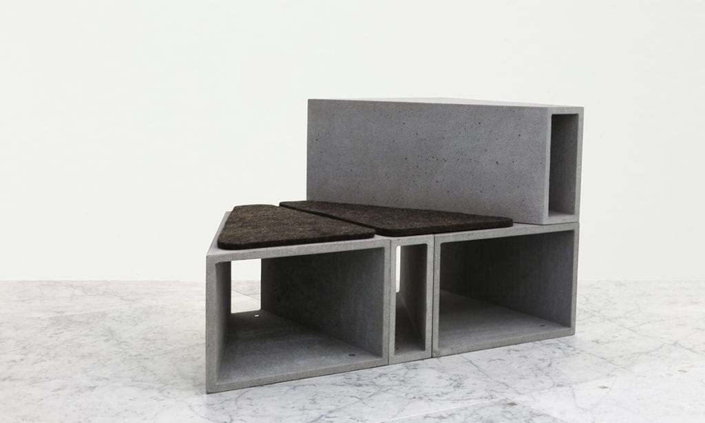
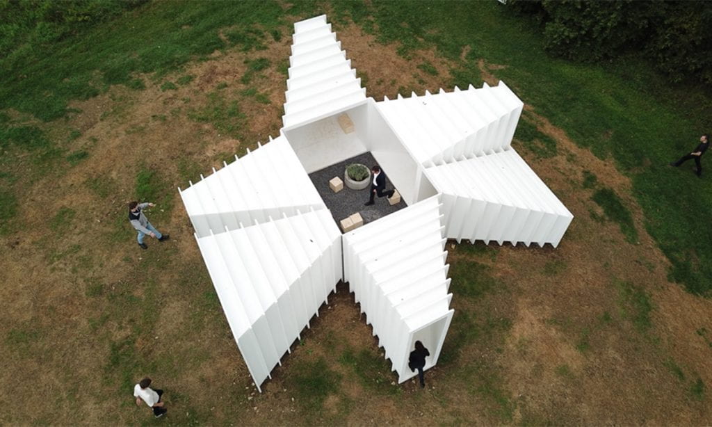
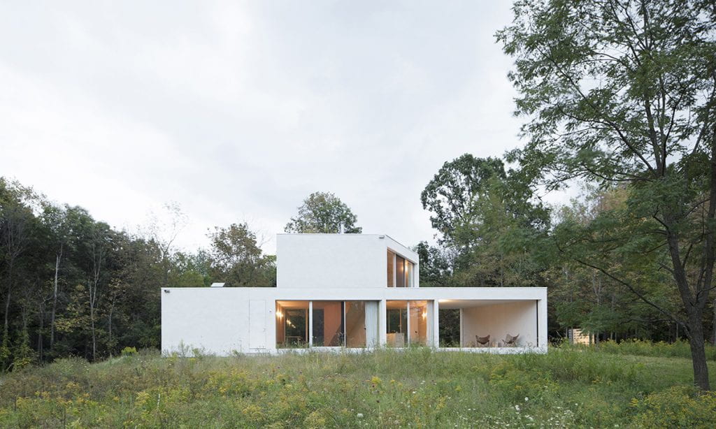
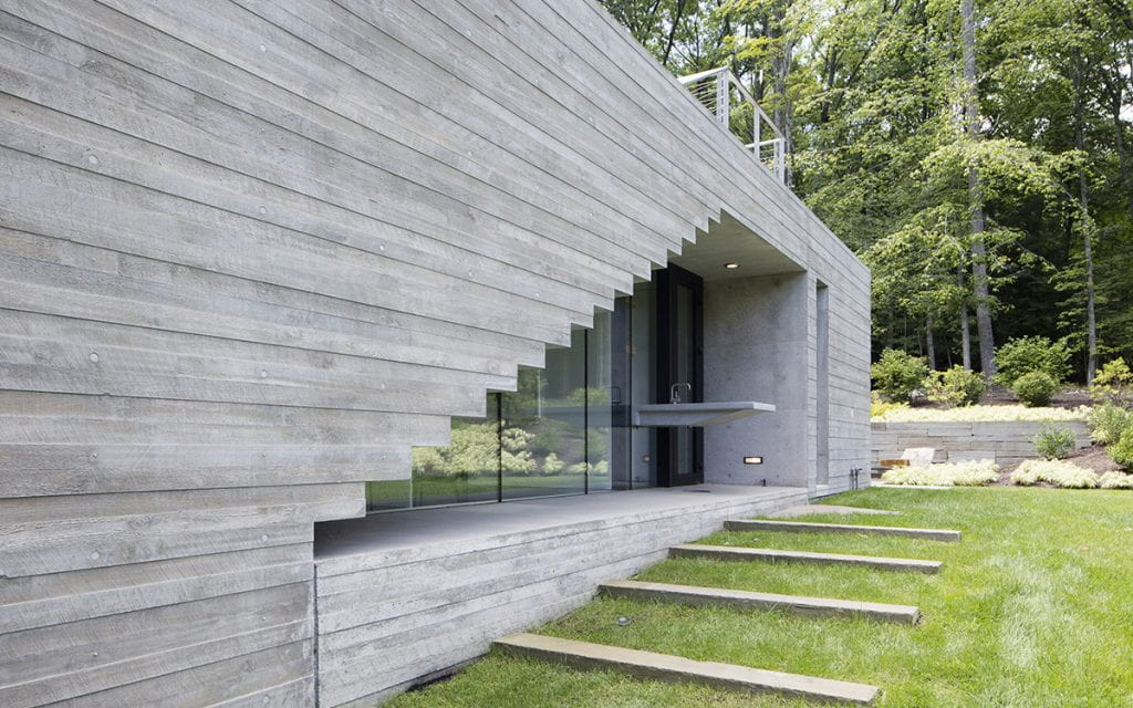
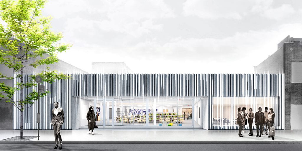
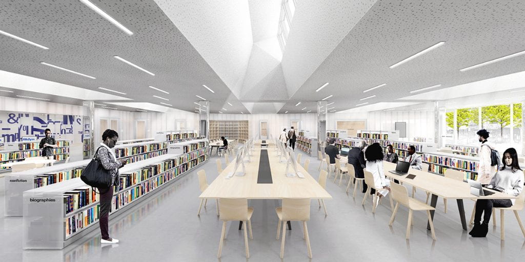
- With your work Not to Scale, you expressed a fluidity in how you explore architectural motifs across the scalar spectrum. You also make architecture that is intimately connected to and, in many ways, designed by its physical site. How does an architectural idea translate when transported from a wooded hillside Upstate to a storefront in New York City? How could the same logic that makes a semi-enclosed deck also apply to the structure of a chair or the form of an entire library? In other words, how well does architecture transcend scale?
We love this question and it is one that we ask all the time. We were both trained as artists before we studied architecture and we are fascinated by this translation from an abstract, sculptural space to architecture that needs to provide heating, cooling, plumbing, etc. For the exhibition, this happens at all scales. We were obsessed with the share of a right trapezoid — we call them “zoids.” We studied this shape at the scale of furniture, an art pavilion, and a house and as a larger building. We built the furniture, the pavilion, and the house. Each iteration, by necessity, required the form and aggregation to change. These changes came from the site as well as the scale of the built form. For instance, with the benches for the Miami Design District, we rounded the edges and corners to be more comfortable for seating. For us, the abstract pieces are a starting point, not an end. We try and hold on to it as much as possible, but we also allow it to transform as needed.
- In architecture school, students are often kept from talking about aesthetics, as if design is a purely theoretical or a fully explanatory act. Do you think about your own aesthetics, are they ever compromised, and do they ever bump against or cross conceptual boundaries? Can aesthetics be political?
For me, it is hard to describe one’s own aesthetics because you are always pushing toward something, not necessarily resolving it. It is a process — or at least it is for us. We do not follow a dogma or a singular aesthetic style. Our approach to design is constantly evolving. It is rare that a project doesn’t have changes that are perceived as compromises at some point. Sometimes these changes have made a project more restrained and focused. Constraints (which are different from compromises) can be beneficial to the process. Sometimes a constraint can initially be perceived as a compromise. In general, we try to have a core idea that is not rooted in one particular aesthetic but more nimble and able to translate and pivot if need be. That conceptual core idea can really help when changes need to be made. I think that aesthetics can be political — for instance, a choice of material — where it is sourced, how is it produced, etc. can have political, and obviously environmental and social implications.
- Upon completing my first built work, I observed a type of natural abstraction that occurs in the translation of a drawing into a built thing. (This is much like any well-written translation from one language into another. It is not a literal translation or even a metaphorical one, but what I might call a spiritual translation. If the word ‘spirit’ comes from the Latin word for ‘breath’ and describes the thing that animates life, a building is the thing that animates the architectural drawing. The building unlocks another dimension of the architecture, bringing it into the realm of Gaston Bachelard’s ‘poetic space’: a place fit for daydreams). I am wondering about that experience for you of bringing a project, particularly a large one, from a drawing into a building. Are you ever surprised by what you see? How can a drawing address the complexity of our current urban contexts? Are some buildings better as drawings?
We work a lot in physical models at many different scales. This helps us design and understand the quality of light. But there are always surprises when a project is built. No matter what you do, you cannot anticipate the exact quality of space — light, smell, sound, etc. until it is built and that is always so exciting. To see a space transform within its environment is inspiring. But also, the life of the building only begins with the completion of construction. The occupation of the building brings it to life.
As far as representation, I think that it is rare that one method of representation can capture the complexity of space. That is why it is so important to use all tools of representation and to break representational conventions to convey a sense of place.
- Another favorite essay of mine is Todd Williams’ and Billie Tsien’s essay advocating for and ruminating on slowness. At what pace would you say you work and are you at all frightened by the speed at which our society/technology is moving?
I am not frightened. I think that it is all part of a process — some things need to move fast and some need to move slow. We tend to do both in our practice. There is no one right way. For me, personally, I also feel that slowness is critical to my process. Slowing down and stepping away from the work often helps push it forward. That is also why we like to look outside the disciple to gain an outside perspective and try to be less myopic.
- We’ve focused primarily on your current practice and your thoughts on the state of the architecture discipline. For fun, what was your first architectural memory?
I grew up in Phoenix and my mom drove us to Arcosanti. I was pretty young, but I remember the in-process buildings and gathering spaces and the landscape and the communal living. It made an impression on me. And the homemade muffins at the cafe were delicious!
